The purpose of your website is what it does

Back when I was doing my postgraduate Systems Thinking course, I mentioned Stafford Beer, the cyberneticist who coined the phrase “The purpose of a system is what it does.” This principle, often referred to with the acronym POSIWID, reminds us that intentions and mission statements do not matter much when it comes to people's lived experience.
Recently, we've been testing the Amnesty UK Community Platform for accessibility prior to starting the pilot phase. If I'm honest, I initially I approached it as a compliance requirement, a box to tick. We had self-imposed standards to meet (WCAG 2.1 A/AA) so we needed to check that we aligned with them.
Along the way, I discovered that accessibility testing is a way of asking: What does this system actually do? Where are the gaps between how you think it works and how it actually functions?
The great thing is that these days the tools you need to do this testing are already in your web browser.
Four principles (POUR)
The authors of WCAG 2.1 settled on four foundational principles which map onto how humans actually perceive, navigate, and interact with information. You could think of them as a model of how a system functions.
They call these four principles POUR:
- Perceivable: Information must be presented in ways that people can perceive
- Operable: Users must be able to navigate and control the interface
- Understandable: Content and interactions must make sense
- Robust: Code must work across devices and technologies
Instead of treating this as a checklist for compliance purposes, it's probably better to consider it as the axes along which any digital system can be analysed over time. This means that if any of these principles breaks down, it's not just a problem for people with disabilities: you're revealing that your system doesn't work as intended.
Perceivable
When we tested the colour ratios for the default theme on the Amnesty Community, it came out as 3.9:1 in several places. The standard says 4.5:1, but I didn't consider that a huge difference. It felt marginal and I wondered whether we needed to fix it.
When I used Firefox's accessibility inspector I first tried the colour blindness simulator. No problems. Then I enabled the “low contrast” option and found that, at 3.9:1 contrast, text became genuinely unreadable. It turns out that the difference between 3.9 and 4.5 wasn't theoretical but between “the information is accessible to me” and “I cannot access this information.”
The interesting thing is that the simulator simply made problems visible to me that already existed. The problems were there in the system; the tool just revealed them.
This is what the Perceivable part of the POUR acronym means in practice: information either reaches people or it doesn't:
- If a colour-blind user can't distinguish two interface states because you've only used colour to differentiate them, the information doesn't reach them.
- If contrast is too low, someone with poor vision cannot make out the text, so they cannot access the information.
- If you've described an image with "image123.jpg" instead of meaningful alt text, people using screen readers miss the information.
And it's not just people with disabilities that pay the price here. We've all experienced one or more combinations of the following frustrating experiences: using a small screen, a borrowed or old device, in poor lighting, when we are tired, distracted, or suffering from low bandwidth. In all of these situations, information needs to remain perceivable. Your system either accommodates these contexts or it doesn't.
Operable
When was the last time you navigated a website solely with a keyboard? Tabbing through the Amnesty platform without touching a mouse, which is based on Discourse, made me appreciative of the care that the developers had taken to ensure users know where they are.
This is not usually a problem for those using a mouse or trackpad, who can see their cursor. But losing focus is a complete blocker for anyone navigating with a keyboard. There are many reasons someone might be navigating in this way: they might have a motor impairment, they might be a power user with a preference for efficiency, or they might be using software mapping voice inputs to keyboard commands.
Thankfully, in our case, we didn't have to fix anything. With other sites we might not have been as lucky. But the check made me realise that when testing things like keyboard navigation, you're essentially asking: does this system work for people navigating in ways other than I do?
Understandable
With the Amnesty Community, we're creating a structure for activists and staff to communicate. They are creating most of the content, rather than us.
However, there are still the guidelines, training materials, notifications and automatic emails that are sent to community members. The Discourse defaults are good, but we also had to ensure that what we'd created would be clear for people without the context that we've built up over the last few months.
While preparing for the pilot, Amnesty's community manager pointed out that the “missions” we'd created to onboard new community members might be confusing for nuerodivergent people. Her experience had been that fun approaches were laden with ambiguity and were potentially confusing for those who take things literally.
We rephrased what we had written, and also double checked it to ensure that it would make sense to those for whom English is an additional language. By simplifying language and restructuring headings, the missions were improved. On reflection, phrases such as “getting your ducks in a row” requires a kind of translation that was neither necessary nor inclusive.
The principle of understandability asks: Can people grasp both the content and how to use the interface?
- Is language clear and free of unnecessary jargon?
- Does heading hierarchy create a logical structure?
- Are form fields clearly labelled?
- Can users recover from mistakes, or are certain actions irreversible?
- Does the interface behave predictably?
Testing for understandability reveals gaps between your mental model of how the system works and how users actually experience it in practice.
Robust
This final principle is as much about how you build from the beginning as it is about testing. A <button> element announces itself as a button to screen readers and assistive technology. A <div> styled to look like a button, on the other hand, does not. Does your code reflect the meaning of what you've built?
ARIA (Accessible Rich Internet Applications) exists for situations where semantic HTML doesn't provide what you need. But ARIA is for edge cases. The principle is to use HTML elements for their intended purpose first. Discourse does not rely heavily on ARIA, but remains accessible.
This matters as it means your code will continue to work when new assistive technologies emerge. It also means search engines can parse your content correctly, voice assistants can interact with your interface, and future technologies that haven't been invented yet will have a better chance of working with your code.
Robustness is about building in ways that remain stable under changing conditions. Not building for today's tools, but building in ways that are resilient to change.
Basic testing
To get started, you don't need expensive software or specialist consultants. This was the biggest surprise to me. There are tools that are already built into your browser, and so you just need a willingness to spend time using what you've made.
Browser DevTools
Every modern browser includes accessibility inspection.
Open Chrome or Edge DevTools (F12 or right-click + Inspect). Find the Accessibility panel. Select any element and you'll see its accessibility properties: its name, role, whether it's keyboard-accessible, contrast ratios.
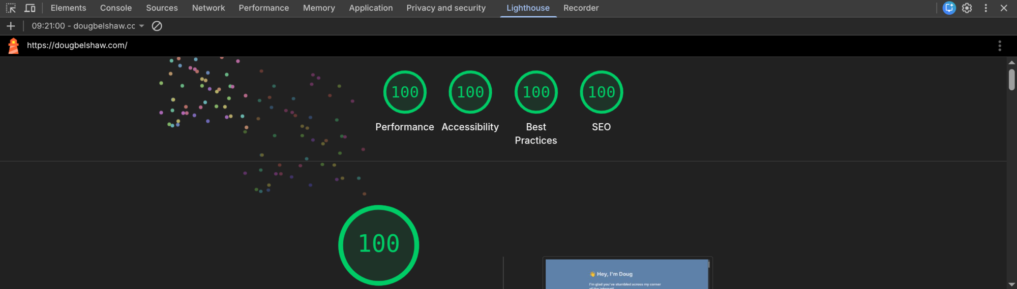
Run Lighthouse (DevTools > Lighthouse > Accessibility). It audits for missing alt text, poor contrast, broken heading hierarchy. Takes about two minutes. You get a score and specific issues to address.
Firefox has similar features. So does Safari.
IBM Equal Access Accessibility Checker
Once you've run browser checks, the IBM Equal Access Accessibility Checker goes further. It's a free browser extension for Chrome, Firefox, and Edge.
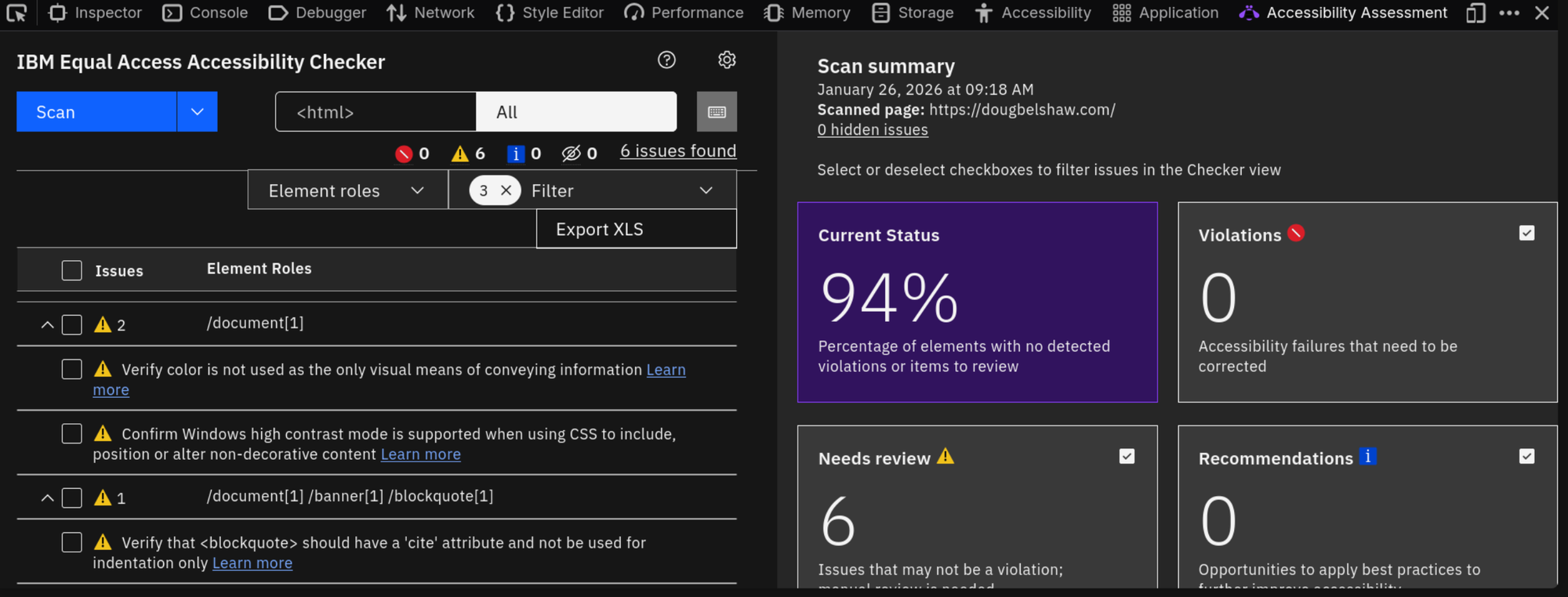
Install it, then navigate to your page. Open DevTools and find the Accessibility Assessment tab. Click Scan.
It validates against both WCAG 2.1 and EN 301 549, flagging issues and suggesting code fixes. It includes a dedicated keyboard navigation checker, and you can scan multiple pages at once to identify patterns.
We used this on the Amnesty Community and found issues we'd missed. It also revealed that the same problem appeared across multiple pages, which changed how we prioritised fixes.
Manual Testing
Automated tools often catch about half of accessibility issues. The remaining half of WCAG success criteria require human judgment.
- Keyboard-only navigation: Don't touch your mouse. Tab through your entire product. Use arrow keys. Press Enter. What breaks? Where does focus disappear? Where do you get trapped?
- Screen reader testing: On Windows, download NVDA (free). On Mac, VoiceOver is built in. Turn on the screen reader and listen to your site. Does the reading order make sense? Are images described? Are form labels clear?
- Colour blindness simulation: Firefox's accessibility inspector includes a colour blindness simulator. Look at your site through different types of colour vision deficiency. This is where the 3.9 vs 4.5 contrast issue became real to me.
Final words
Testing accessibility forces you to interact with your system in ways you normally wouldn't. As such it reveals gaps between how you think the system works and how it actually functions.
When you test keyboard navigation, you discover whether your interface actually works for people navigating without a mouse. When you use a screen reader, you discover whether your code structure makes sense. When you simulate colour blindness, you discover whether you're relying on colour alone to communicate.
It's easy to dismiss these as edge cases, as I have done in the past, but they're equally valid ways of interacting with your system. A system that only works for one way of interacting is a system with structural gaps.
My experience with the Amnesty Community made me realise that my own websites were less accessible than they should be. That's why if you visited this blog a couple of weeks ago compared with this week, the shade of blue has changed to improve the contrast, as it has at dougbelshaw.com. I built my new Dynamic Skillset website in light of this work. I not only made it extremely lightweight, but if you look at the code it's also extremely accessible.
Once you test, the gaps become obvious. And once they're obvious, fixing them matters. Stafford Beer's principle applies: the purpose of the platform is what it actually does – gaps included.
Tools and Resources
Standards
- WCAG 2.1 - Web Content Accessibility Guidelines
- Understanding WCAG 2.1
- EN 301 549 - European Standard for Digital Accessibility (PDF)
Testing
- Chrome DevTools Accessibility Reference
- Firefox Accessibility Inspector
- IBM Equal Access Accessibility Checker (free browser extension)
- NVDA Screen Reader (free)
- WAVE Web Accessibility Tool (free)