Turning polygonal badges into contours of practice
A few weeks ago, I shared a post in which I suggested that badges-as-radar-plots could change shape as someone's skills develop. A bit like a mini e-portfolio, rather than a single snapshot image.
That post got a lot of interest, so I've been experimenting with a tool, which I initially based on Badge Studio, to take things a step further.
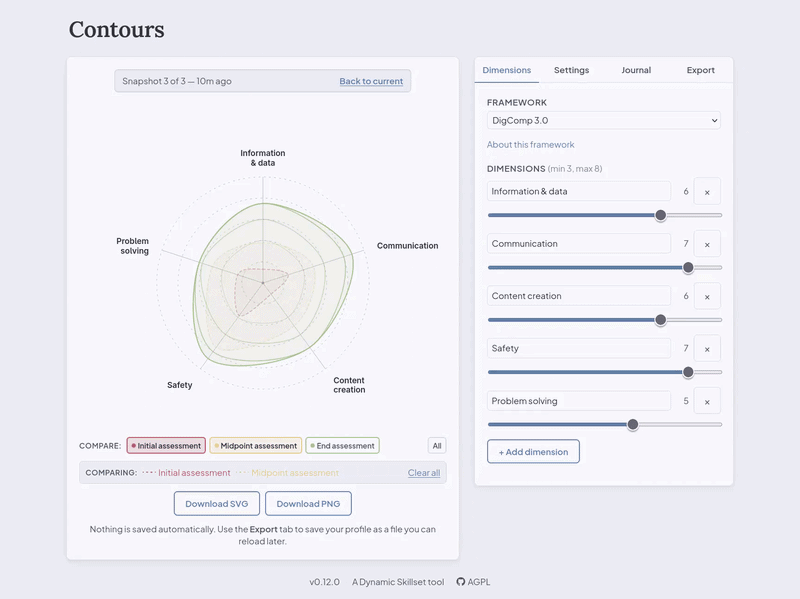
The result is Contours, a usable work in progress that provides an easy way to turn data into a layered, topographic-style view of a learner’s skills progression over time. The example uses the DigComp 3.0 framework but you can define the axes and values yourself. The tool draws contour lines that, as you can see in the gif at the top of the post, can show things like an initial, midpoint, and and endpoint assessment on the same badge image.
Although the Open Badges v3.0 standard doesn't require an image, I still think it's usually a good idea to include one. And the good thing about this version of the standard is that the evidence of progression is baked into the underlying metadata, not just into the graphic itself.
As you can see from the version number (v0.12) this is very much an early experiment rather than a polished product. So it's a good playground for people exploring different ways of showing progression to try something different.
You can try Contours at contours.dynamicskillset.com and, as it's Open Source, you can install or adapt it yourself with the code living at framagit.org/dynamicskillset/contours.
If you do give Contours a go, I'd love to hear how you found it. What kinds of use cases can you imagine it being useful for? Which direction would you be interested in taking it next?